 Because of some of the continuity errors in the piece and indeed problems concerning some of the lighting, I believe it would be in our best interests to re-shoot portions of the piece, both the fix the continuity and indeed also boost the shot quality of the piece. In Addition to this the most major change to this piece will be the placement of the credits as they will be placed at the start of the piece instead of being placed at the end, this allows us to use an actual title for the film instead of omitting one from the piece.
This blog will be used to show my progression through my AS Course in Media Studies
Wednesday, 26 February 2014
Important Aspect of Re-editing the Piece
 Because of some of the continuity errors in the piece and indeed problems concerning some of the lighting, I believe it would be in our best interests to re-shoot portions of the piece, both the fix the continuity and indeed also boost the shot quality of the piece. In Addition to this the most major change to this piece will be the placement of the credits as they will be placed at the start of the piece instead of being placed at the end, this allows us to use an actual title for the film instead of omitting one from the piece.
Monday, 24 February 2014
Improvement Proposals to Piece

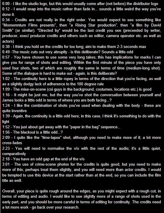
Above is a list of proposed changes to the Piece. I will use this as a guideline for the most part and will refer to it when editing my piece. I will attempt to describe how I will be changing things in the piece to create a better cut in brief here, but I will also clarify once I have created an edit to one of these items in the Blog as usual.
Comments on Proposals:
I whole heartily agree with these statements in full and I would like to go through them to maybe clarify my mistakes and why I may have made them, essentially this would help me to understand how I managed to make these mistakes and avoid them in the future.
First off, I think the reason why I misplaced the studio logo was simply because I didn't clarify to my partner well enough that after I made it, that it would be placed second, Because I made it second, we accidentally placed it in based on the order we imported them in without having enough thought put in. In addition to this most of the credit choices we made were in fact misplaced, this was partly due to a misunderstanding concerning how long the credits would be, without thinking to clearly we attempted to put as many credits within the piece, not essentially which ones were the most important, leading to a lack of order. still concerning credits, I think that we made the credits longer to string out the end sequence but a better method for this could be to include more pictures or even relating to my research in the film 'Red Dragon', the inclusion of newspapers could also be effective.
 |
| The Continuity Issue: Caused by accidental movement of the cast |
The Continuity factors of this piece seem inconsistent and I think we could benefit from a clean cover over our footage to make the footage tighter in a sense. I personally have issues with the shot reverse shot factor between the two detectives while walking because of both where they start and the general shakiness of the camera, It isn't a huge issue, but I really think that we are probably going to re-shoot that scene just for the sake of a cleaner look. As I have illustrated the main problem for the continuity we accidentally created, was that the characters start closer to the set item in the centre of the room, while not expressing any time where they have moved between the shots, disorienting the audience as a result.
The gap at the end of the piece was an unintentional mistake while rendering on my part and it was simply a minor error that can easily be fixed, however, the gap after the narration was intentional to create a sense of seriousness, as if the information was relevant and required processing, I think that can be edited into a better shape however and I will be doing so accordingly
The Props for the piece, were something that my partner was very proud of and I thank her strongly, she was in fact the main contributor for these items and indeed was the one who came up with the suggestions for what our characters were going to wear during the piece.
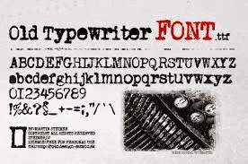
 Finally, I very much agree with the last comment, the credits with the crime scene photos would in turn give the film a much more interesting start, essentially it has the opportunity to create some high quality impressions from the get go, instead of what is essentially a plain black text title, It would help the audience to grasp the aspect of the film as well as it would indicate from the start the theme. While the original piece proposal didn't include a film title, I have some strong ideas for a title now, involving typewriter fonts, in addition to newspaper style credits to give the film a slightly rougher style.
In total, the film isn't a lost cause in any sense from what I have seen, I think that given our time frame we have plenty of opportunities to clean the piece up a bit and maybe develop a few more shots to give it more variety, while my partner is absent today, I'm sure she shares many of my concerns and also has her own ideas for improvements which I will gladly develop with her as she develops mine.
Friday, 14 February 2014
Rough Cut
False Impressions from David Smith on Vimeo.
This is our first rough cut for our piece, False Impressions, to save time we decided to use a placeholder for the actors names, they would essentially be placed in the sections of each picture that have the most room, e.g. tape on doors has room on both the top and the bottom of the screen.
Thursday, 13 February 2014
Production Company Title

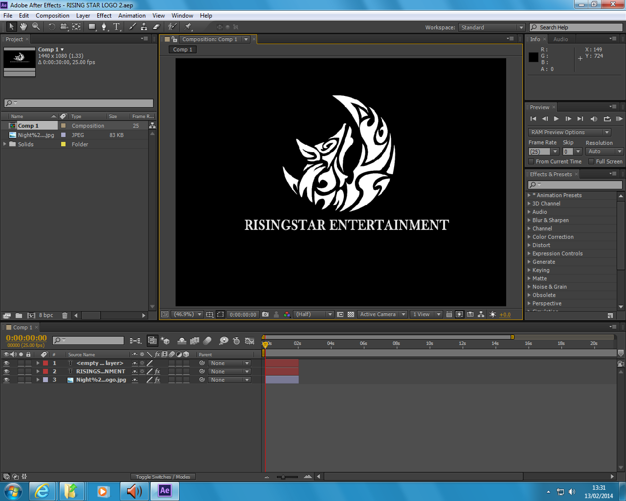
- For the production company title at the beginning of the movie before the Momentum films logo, I have created this indent for us to use, as you can see the name of the company is RisingStar Entertainment but what you cannot see is that this is also accompanied by a wolf howl that Amy is adding.
Wednesday, 5 February 2014
Creation of a name for the Film and Age rating change
For the films's title we have decided together that False Impression is a strong title to use, it is quite closely related to the piece story after all, the killer is constantly deluding the detectives, Giving them "False Impressions".
However, on a more important note, we have decided to up the films Age classification as well to a 15. We are well aware of the reduction in the box office result due to the less open nature of its ticket sales, but it would be dangerous to keep it at a 12. In terms of the BBFC guidelines, the exposure to gore would be safer in a 15 than a 12. As the story continues the Murders would get more violent and it would be difficult to keep a clean shot as a lot more blood would be visible, and indeed the concept of mutilation would be brought into play.
However, on a more important note, we have decided to up the films Age classification as well to a 15. We are well aware of the reduction in the box office result due to the less open nature of its ticket sales, but it would be dangerous to keep it at a 12. In terms of the BBFC guidelines, the exposure to gore would be safer in a 15 than a 12. As the story continues the Murders would get more violent and it would be difficult to keep a clean shot as a lot more blood would be visible, and indeed the concept of mutilation would be brought into play.
Choice of Location and Characters and relation to Research
The Location: The location of choice was originally going to be a warehouse, I thought that many in my research a number of locations are rather rough and industrial. Batman Begins for example effectively uses this effect. However, along with the key issue of finding such an area in addition to recieving permission to use it, I found that a House as a crime scene can actually be done rather well. as it has been in films such as 'Se7en', Given that two of the more gruesome murders took place in 1. An apartment block (Sloth) and 2. A suburban house (Gluttony). The story would also carry on to show murders of an increasingly violent, disturbing and confusing style later on in the film and that would essentially work as a inpromptu time frame, that if the detectives couldn't figure out the case the next would be increasingly horrific. The murder aspect essentially gives the film its crime element while the time frame idea gives it that strong pacing found in thrillers, essentially working against the clock.
Characters: As it stands there are two main characters in our piece, Both of which are detectives yet one is older and more experienced, not only was this idea concieved from yet again, the 'Se7en analogy. But more specifically, from my Skyfall research, I found that two main characters that vary in style and attitude can be rather refreshing for a concept. In 'Skyfall' Bonds Reckless attitude conflicts and contrasts with that of Moneypenny's, yet that is rather interesting in itself, the audience is treated to two different working styles, and the fact that both characters have their own pro's and con's in our piece, the concept would lead on to Alex Cross, the younger detective, finding difficulty stomaching the Murderers MO and why he would commit the crime he has. For the older detective the concept would work around him discovering how innefective his police force is in handling this case, which in turn would lead the two to work outside of the normal box of thinking.
Characters: As it stands there are two main characters in our piece, Both of which are detectives yet one is older and more experienced, not only was this idea concieved from yet again, the 'Se7en analogy. But more specifically, from my Skyfall research, I found that two main characters that vary in style and attitude can be rather refreshing for a concept. In 'Skyfall' Bonds Reckless attitude conflicts and contrasts with that of Moneypenny's, yet that is rather interesting in itself, the audience is treated to two different working styles, and the fact that both characters have their own pro's and con's in our piece, the concept would lead on to Alex Cross, the younger detective, finding difficulty stomaching the Murderers MO and why he would commit the crime he has. For the older detective the concept would work around him discovering how innefective his police force is in handling this case, which in turn would lead the two to work outside of the normal box of thinking.
Subscribe to:
Comments (Atom)